
Agency Landing Page / 2024
Digital Mantras
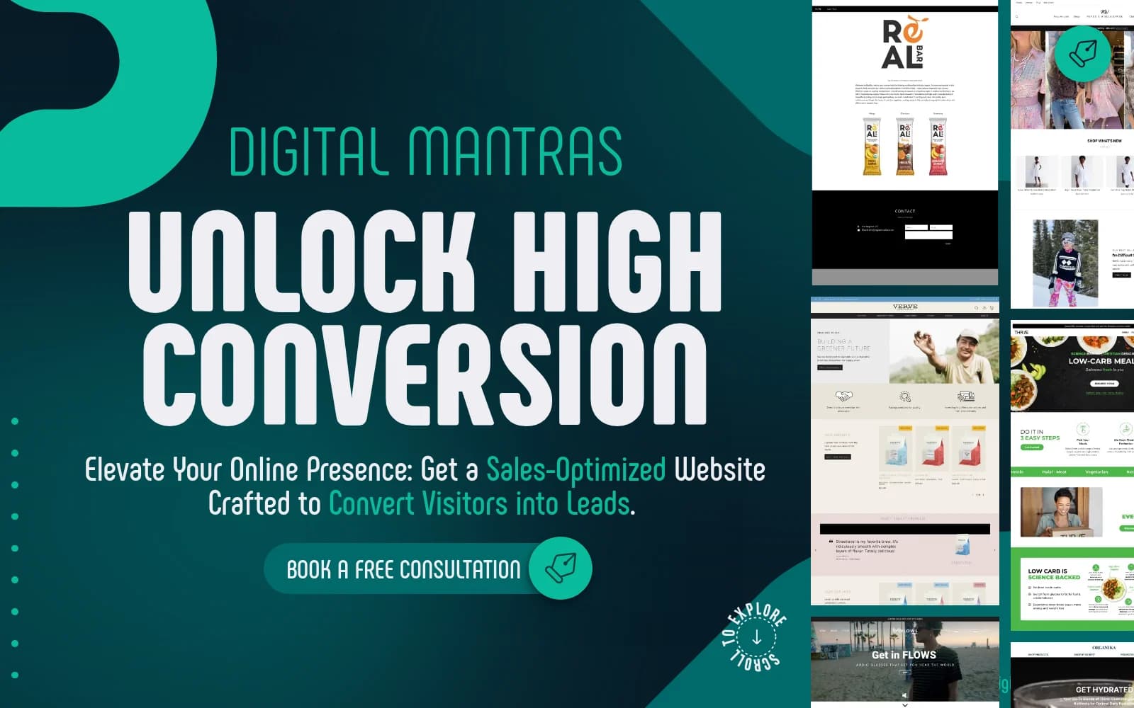
A conversion-focused landing page for a digital agency, built around bold positioning, guided navigation, testimonials, process content, and clear inquiry paths.
The brief
Digital Mantras needed a landing page that did more than present a nice visual identity. The page had to explain the offer quickly, build trust, and guide visitors toward booking a consultation.
The core idea was a sales-optimized website experience: direct positioning, strong proof points, visible calls to action, and a page structure that keeps visitors moving from awareness to inquiry.
Building the page
The design uses a bold teal visual system, oversized typography, fixed navigation, animated website previews, testimonials, benefit sections, process content, and FAQs. My role was to implement the experience so the page felt distinctive while remaining usable across screen sizes.
What I focused on
- A responsive landing page structure with clear sections and navigation anchors.
- Strong hero implementation that immediately communicates the conversion-focused offer.
- Reusable content blocks for benefits, testimonials, process steps, and FAQs.
- Clear consultation calls to action placed throughout the page.
- Frontend polish across spacing, motion, imagery, and mobile behavior.
Development details
The build keeps the page highly visual without hiding the important conversion path. Fixed elements, large display type, scrolling image columns, and bold backgrounds create the brand moment, while the content hierarchy keeps the message understandable.
That balance matters for a landing page: personality gets attention, but structure is what turns that attention into action.
Live site
What I took from it
Marketing pages work best when every section has a job. Digital Mantras was a good example of development supporting strategy: the layout, interactions, and responsive details all point back to one clear goal—helping visitors understand the offer and take the next step.