
Product Development / 2026
Relay Operations
A focused operations dashboard that turns incoming service data into clear priorities, trends, and next actions.
The brief
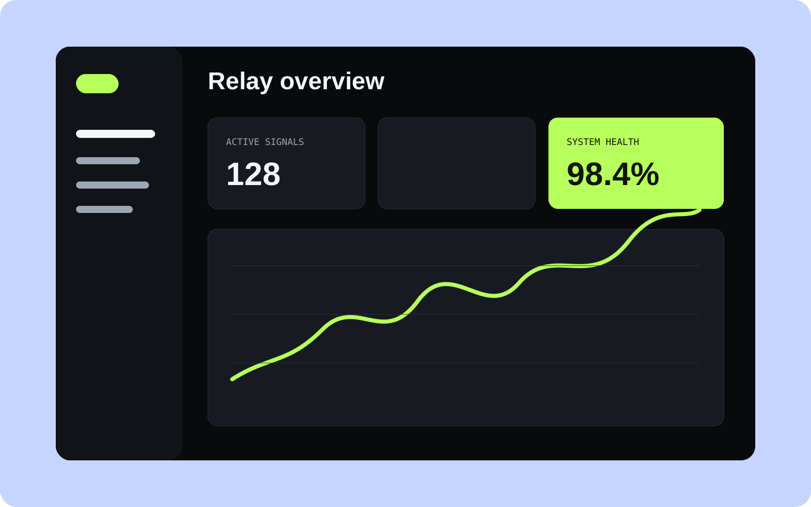
Relay Operations brings service health, open incidents, and team workload into one place. The goal was not to fit every available number onto a dashboard. It was to help someone answer three questions quickly: what changed, what needs attention, and who is already handling it?
Dense operational tools often give every metric the same visual weight. I took the opposite approach and organised the interface around exceptions. Stable systems stay quiet; unusual changes, ageing incidents, and missing ownership move forward.
Shaping the interface
The overview opens with a short status summary followed by active issues and trend context. Filters are reflected in the URL, so a particular team or date range can be shared without asking someone else to rebuild the view.
Tables remain the backbone of the product. Charts are used when a pattern genuinely benefits from visual comparison, and each chart has a labelled or tabular alternative. This also means useful information is available before client-side enhancements finish loading.
Technical approach
- Next.js renders the main views and route-level data states.
- TypeScript defines the boundary between processed records and UI components.
- Python normalises incoming records and calculates trend summaries.
- Query parameters preserve useful filter and sort state.
- Shared empty, loading, partial-data, and error patterns keep pages predictable.
Designing for imperfect data
The most valuable states were not the polished default screens. Real operational data can be delayed, incomplete, or briefly unavailable, so every view distinguishes between “nothing happened” and “we do not have the full picture yet.” Timestamps, source labels, and recovery actions are part of the interface rather than hidden in logs.
I also kept colour secondary to labels and icons. Severity is understandable without relying on red, amber, and green alone, and the most important actions remain usable from a keyboard.
What I took from it
A dashboard becomes useful when it reduces interpretation, not when it displays more. The strongest parts of Relay are the boundaries: between urgent and merely interesting, between no data and no activity, and between a useful summary and the records behind it. Those boundaries made the product calmer without making it less capable.